Disclosure: This website uses affiliate links; I may earn commissions at no extra cost to you. Learn more.

I used to dread taking on low-budget web design clients.
When a small business could not afford a fully custom-coded website from scratch, my only option was to install a generic parent theme, tweak a few settings in the old Theme Customizer, and apologize that their site looked exactly like three of their local competitors.
Historically, executing high-level site design on a hosted platform was a frustrating experience of hitting invisible walls.
That era of web design is officially over.
Automattic recently overhauled their pricing and feature access. They opened the core design mechanics to everyone.
Every single paid plan now includes full access to WordPress.com Global Styles, third-party theme installations, custom font uploads, and raw customization options.
You no longer have to pay $150 a month to a random hosting company just to change the hover state of a button or access your own style sheet.
I test website infrastructure for a living, and this specific update completely changes how WordPress developers and small business owners should approach digital branding.
You can now build a highly custom, professional user interface while still relying on managed server architecture to keep everything secure.
Here is my strategic blueprint for moving beyond cookie-cutter templates and building a truly unique brand using the native Full Site Editor now available to you.
The Problem with the “Cookie-Cutter” Template Trap
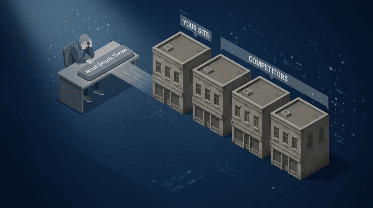
Before we dive into the technical execution, you need to understand why relying entirely on out-of-the-box landing pages actively harms your business.
When you buy a premium theme and just fill in the blanks, you are inheriting someone else’s visual identity.
Consumers are highly visually literate. They subconsciously know when a website looks cheap.
To command premium pricing for your services, you must present a premium digital face.
In the past, users on a basic free plan or lower-tier paid plan were stuck with limited customization options.
If you wanted to drastically alter the layout, you had to manually build a Child Theme, open up the File Manager, and mess around with PHP template files and template tags.
It was a nightmare for non-developers.
Now, the modern Site Editor actually works with you, eliminating the need to hack core Theme files just to make your brand look authentic.
Mastering WordPress.com Global Styles in the Block Editor

Global Styles allows you to change a color code once and automatically update every single button and heading across your entire website.
The biggest mistake amateur web designers make is styling HTML elements page by page.
They highlight a text block, manually change the font size, and pick a random background color.
Then, they go to the next page and try to guess those exact same settings.
This leads to a disastrous user experience where margins and colors are slightly different on every single URL.
The solution is the central design engine.
That’s what the WordPress.com Global Styles is.
It acts as your universal command center inside the modern Full-site editor.
Centralized Color and Background Rules

With this feature available to you, instead of manually typing hexadecimal color codes onto every single page, you define your brand palette once in the Global Styles interface (found right inside your Appearance section).
You set your primary brand color. You establish your secondary accent color. You define your default text colors and everything else that you need.
You can also establish a global Background image or a solid background color that automatically applies to your main content wrappers.
If you decide to rebrand six months from now, you simply change the primary color in your Global Styles panel and every button, hyperlink, and header on your entire website updates instantly.
Obviously, this applies to every other setting as well.
Universal Spacing and the Media Width Setting

A professional visual identity relies heavily on consistent whitespace.
The global design interface allows you to dictate the exact padding and margins for your entire site.
You can configure the Media Width setting so that your standard text blocks stay within a readable 800-pixel column, while allowing specific image galleries to break out into a wide alignment.
By setting these mathematical rules universally within the block editor, you guarantee a highly structured layout.
Elevating Your Brand with Custom Web Fonts
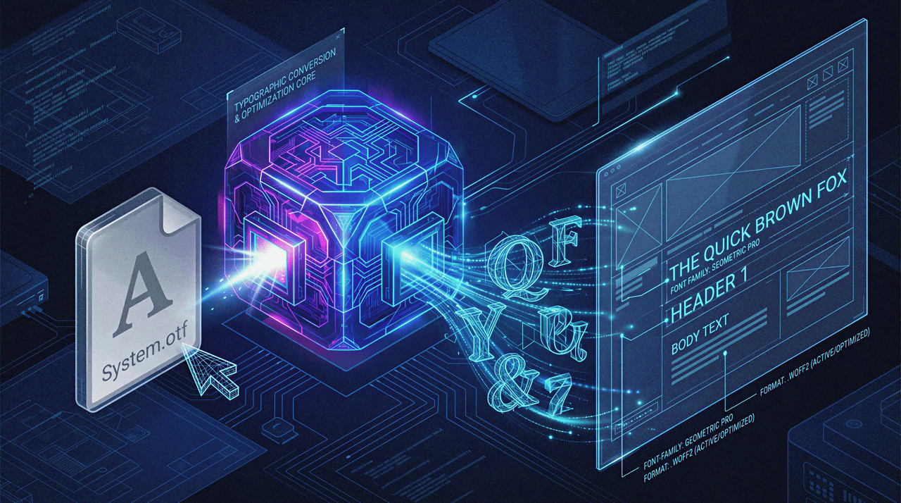
All paid plans now allow you to directly upload raw font files into your Media Library without needing third-party typography plugins.
Typography is the silent ambassador of your brand.
The fonts you choose communicate your industry and personality before the user even reads your marketing copy so it’s extremely important.
Historically, hosted website builders restricted you to a small handful of safe, pre-approved Web fonts.
But since all paid plans now support custom typography, that restriction is completely gone.
You can upload the raw font files that you have directly on your website and it will be ready to use.
Applying Typography Universally
Once uploaded, your custom fonts integrate seamlessly.
You can assign a bold, striking custom serif to all of your headings, while setting a specific font style and font size for your body paragraphs to maximize readability.
The managed infrastructure automatically handles serving these files efficiently.
You get the aesthetic benefit of custom typography.
You don’t destroy your Core Web Vitals. Your overall Page Speed stays high.
The Absolute Freedom of Custom CSS
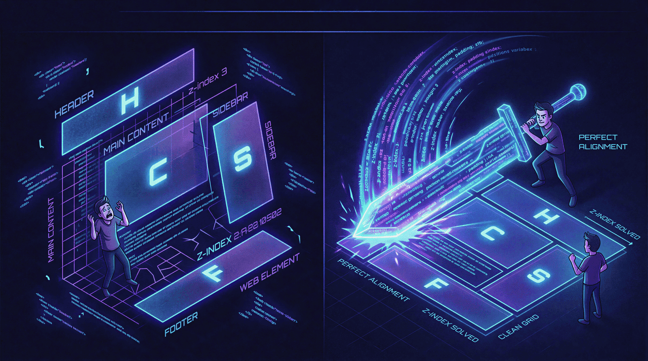
You no longer need to edit core PHP files to change your layout.
You can write CSS overrides directly in the native editor.
Even with the most advanced visual builders, you will inevitably hit a wall.
You will want a specific image to overlap a text box, or you will want to change the shadow color of heading 1 to match a specific brand hex code.
To achieve pixel-perfect design, you need to write raw code.
The unlocking of Cascading Style Sheets on all paid plans is the single greatest victory for power users who wants the absolute free to customize everything.
Injecting Code via Additional CSS

You do not need to install the old WordPress Theme Editor or use a third-party WP File Manager to alter your design.
You simply open the Additional CSS panel in your editor and inject whatever CSS you need.
If a third-party plugin generates a booking calendar that looks misaligned, you open your browser developer tools, right-click the element, and click Inspect Element to identify element classes.
Once you identify the specific CSS class controlling that calendar, you drop it into your Additional CSS panel and write new rules.
You can adjust the padding, write Media queries to fix mobile spacing, or completely hide specific CSS classes from rendering.
Nowadays, even if you don’t like coding, you can take help of AI Chatbots as they gotten so much better.
Advanced Layouts and Snippet Management

With raw CSS access, you can deploy advanced techniques like CSS Grid to build complex, magazine-style layouts that standard blocks cannot handle.
You can also write Inline CSS or trigger smooth CSS Animations so buttons react when hovered.
In the old days, you had to install plugins like Simple Custom CSS just to achieve decent snippet management.
Now, it is entirely native.
Even better, the platform maintains a CSS revision history.
I accidentally broke my entire mobile layout with a bad media query a few days back.
And because of this, I just clicked ‘restore’ in the CSS revision history and fixed it in three seconds.
Integrating Design with the Massive Plugin Ecosystem

Design does not exist in a vacuum. It has to work seamlessly with your website’s functionality.
Because you now have access to 50,000+ tools, your design choices must accommodate complex plugins that you might want to use.
Styling E-commerce and Complex Flows
If you are building Product Catalogs or optimizing Checkout Flows for an online store, visual consistency is critical for conversions.
You can use plugins like Checkout Field Editor to add custom fields, and then use your CSS editor to ensure those new fields match your global styling.
If you want to bypass standard blocks entirely, you can install trusted content libraries like Spectra Gutenberg Blocks to instantly deploy pre-designed sections, knowing your Global Styles will automatically adapt their colors to your brand.
Protecting Your Setup
When you give yourself the power to edit CSS and install heavy plugins, you also introduce risk.
To protect your professional setup, you also need to take care a few more things:
Performance: Run caching tools. While the managed servers are fast, using Jetpack Boost or WP Rocket ensures your heavy visual assets and CSS files are minified properly.
Permissions: If you are a freelancer handing the site over to a client, do not let them break your CSS. Use some role manager plugin to restrict their user roles so they can only write blog posts, keeping them out of the Appearance section entirely.
A Practical Redesign Workflow

Now that you have access to these enterprise-grade tools, you need a disciplined workflow.
If you just log in and start randomly changing colors, you will create a mess.
Here is exactly how I approach a redesign.
Step 1: The Off-Screen Wireframe
Never start a redesign inside the software.
I map out my exact color codes and select my fonts beforehand.
I might open Visual Studio Code to draft some complex CSS snippets, or check Stack Overflow for specific CSS Grid solutions.
I always have a plan before I touch the live server.
Step 2: The Global Configuration
Once the plan is locked, I log into the dashboard. I do not touch a single page or blog post.
I spend my first hour entirely inside the global settings.
I upload the custom fonts, establish the global color palette, and configure the base styling.
I am building the foundation of the house before I start decorating the rooms.
Step 3: Content Assembly and Plugin Checks
With the global rules established, I drag the blocks onto the page.
I check plugin compatibility by installing my required tools and verifying that their output respects my new global colors.
If a plugin ignores my settings, I use the browser’s Toggle device toolbar to preview the site on mobile and prepare to write overrides.
Step 4: The CSS Polish
After the entire site is built, I do a final review.
I clear my browser cache to ensure I am seeing the live version and same on the server end.
I look for tiny imperfections.
I open the CSS panel and write specific custom CSS to fix layout quirks, utilizing Widget CSS Classes if I need to target sidebar elements.
This is the final layer of polish that separates a decent site from a great one.
The Era of Compromise is Over

For over a decade, small businesses and freelance designers had to choose between two bad options.
They could either use a hosted platform that was secure but visually restrictive, or they could buy cheap unmanaged hosting to gain design freedom at the cost of constant technical anxiety.
That compromise is no longer necessary.
The ability to use WordPress.com Global Styles, upload custom fonts, and write CSS on an entry-level managed plan is a profound shift in the responsive design landscape.
You have the tools required to build a massive, highly custom digital brand.
Stop settling for cookie-cutter templates that make your business look like a carbon copy of your competitors.
Log in, open the style panel, and start building a digital presence that actually reflects the quality of your work.